Exercise 2.3 – Typologies

Read Sean O’Hagan’s article on the New Topographics exhibition and publication: http://www.guardian.co.uk/artanddesign/2010/feb/08/new-topographics- photographs-american-landscapes and watch this video of Lewis Baltz talking about his work:http://www.tate.org.uk/context-comment/video/tateshots-lewis-baltz

Write down your own responses to the work of any of the practitioners O’Hagan mentions in his article, and describe your thoughts on typological approaches.

https://www.theguardian.com/artanddesign/2010/feb/08/new-topographics-photographs-american-landscapes

Typologies

As I understand it as “typology” is a study based on types or categories, for example photographers such as Bernd & Hilla Becher (industrial buildings and structures) or August Sander (portraits of People of the 20th century). Whereas, “new topographic” was term invented in 1975 by William Jenkins to describe an a much disliked exhibition of banal images of warehouses, city centres and suburban homes by artists such as Gohlke, Robert Adams, Stephen Shaw and Lewis Blatz. The artists were seen as working in contrast to the likes of Ansel Adams and Edward Weston who wee seen as working in the tradition of nature photography.

This new breed of photographers were creating new landscapes of the urbanisation of 1970s America. This new landscapes of this banal exhibition was to become accepted as a legitimate photographic subject. At the time landscapes were making a political statement about the “man-altered landscape” reflecting the growing unease about the industrialisation of the natural landscape.

It’s interesting for me to know that the “new topographics” term is so relatively new.

The link to Lewis Baltz’s Tate video did not work but I looked up another:

Listening to Lewis Baltz talking about his work on the Tate video, three comments really struck me in what he said.

Firstly he believes that ‘Photography is the only deductive art, every other medium begins with a blank sheet. Photography starts with a world that’s perhaps overfull and needs to sort out from that world what is meaningful’. I hadn’t thought about photography in this way before, but as soon as you hear Baltz’s statement it seems obvious, painting, drawing all start with a blank sheet of paper, whereas in photography you start with what you have in your viewfinder and then frame the image in the way that you think will give the best final result. Having said this, and thought about this a bit more, Baltz’s statement is not totally true, in that with the use of digital manipulation the image can be added to – its not all about deductive art.

The second comment Baltz made was about the worls splitting between those who follow Matisse and those who follow DuChamp. He said ‘I love Matisse but I find DuChamp a thousand times more interesting’. I had studied both artists on previous courses, but had never considered them as a binary option. I don’t think that Baltz means it literally, but the point that I think that he is making is one about making the viewer consider, or think about, the product presented by the artist rather than simply admire the technique or beauty of the image.

Finally Baltz says that he is often asked why there are no people in his images. He replies The place for people in my work is the viewer. I found this an interesting point, he is consciously trying to produce work for viewers to engage with. It would be interesting to know if he thought that by including people within his images, whether that would affect the dynamic of how the viewer interacts with it.

Having read Sean O’Hagan’s article I was attracted by the work of Nicholas Nixon. I found a selection of his work at The Fraenkel Gallery  All of the images were of cities and were all taken from an elevated position. This had the effect, for me, of emphasising the geometrical shapes of the buildings and city layout. It is an interesting approach to adopt the same elevated viewpoint for a series of images, it almost gives a bird-eye view, as if one is a third party observer of a conurbation rather than one who inhabits or visits such a place.

It is interesting to study Nixon’s work New Topographics, particularly as it is so very different to what I would have classified as landscape photography before I started this course. It is all impersonal but strikingly geometrical, Nixon has really brought out the shapes in the scenes.

EXERCISE 2.5 – Text in Art

In a similar manner to Richard Long’s ‘textworks’ (see http://www.richardlong.org), write down 12 – 24 brief observations during a short walk or journey by some means of transport. This may be the journey you intend to make for Assignment Two, or it ma be a different one. You don’t need to take any photographs.

Consider how you might present your observations. For some more inspiration on text-based artwork, see:
Ed Ruscha: www.edruscha.com
Barbara Kruger: www.barbarakruger.com
Mark Titchner: www.marktitchnerstudio.com
This exercise is designed to help you think about text as an alternative or additional
means of expression, and to provide an opportunity to experiment with presenting
text creatively.

This was a short walk I took from the car park on my way to what was promising to be a difficult meeting.

I live in the historic market town of Alnwick in Northumberland where the Alnwick Castle features large. It is a major tourist attraction having been the venue for the Harry Potter films. Directly in front of the castle is a car park with a line of mature trees between them.

On this day I parked my car and saw that there was major felling of all the trees revealing the castle sitting on high ground in all it’s glory.

The Duke of Northumberland owns many acres of land in the county and is clearing much of it for development and this latest activity made me see red. It is being done in the name of tree management but the trees seemed to be very healthy and there was no reason to cut them down to my mind, especially in the current situation of global warming and climate change.

I have used the work of Barbara Kruger to inspire me for a previous Assignment 5 in Context & Narrative, “Save Windy Edge Fields” https://wordpress.com/view/lyndawsite.wordpress.com.

Like the work for Assignment 5, this is an emotional piece of work. For this exercise I have used the style of Richard Long.

References:

Long R. www.richardlong.org webpage. (accessed 17.1.2020)

Barbara Kruger: www.barbarakruger.com webpage. (accessed 17.1.2020)

Mark Titchner: www.marktitchnerstudio.com webpage. (accessed 17.1.2020)

Ed Ruscha: www.edruscha.com webpage. (accessed 17.1.2020)

Lynda Wearn, Context & Narrative (wordpress blog) https://wordpress.com/view/lyndawsite.wordpress.com (accessed 17.1.2020)

Exercise 2.6

Exercise 2.6: Edgelands

I found the Edgelands and Power readings fascinating, not least because although, I didn’t go to Greenham Common I had friends who did and I was part of demonstrations against the building of nuclear bunkers. Secondly, my husband worked in power stations and was instrumental in the upgrade of the Rugely Power station mentioned in the text.

How things have changed. The cooling of the Cold War to make way for the middle east terrorist threats and the complete move away from fossil fuels even from the expensively upgraded (to reduce emissions) ones (rightly so).

However, I wish now that I’d had the forethought to photograph some of these memories of the past.

I have always been interested in industrial landscape and architecture and the reading of these two chapters have brought me to a new point in my thinking following the decline of heavy industry in the UK.

I am in the process of the Transitions exercise/assignment and I’m photographing a large housing development as it takes shape. Obviously, there is lots of fencing around the site and I’m now wondering how to incorporate that into the brief, wondering what tales they might hold when taken away.

I have already taken two shots that amused me. On one panel of fencing was a red sign asking people to be careful because children were playing and two fence panels away which states children are not allowed on this site! Taken out of context (there is a bike track adjacent to the site) they make no sense and when the fences are gone my photographs as a diptych will be amusing only. I liken this in a way, to the words in the text of “happy childhood memories or feelings of threat”. Not quite the same threat but maybe puzzling to the viewer in future.

The Edgelands where some of the power stations were located are now “brown field sites”, ripe for the development if not already Out of Town Retail Centres. The Metro Centre in Gateshead was build on the site of a power station and coal depot which fed the stations (about four of them within a mile or so of the now Metro centre). All that is left of the history of the area is the enormous remains of the Dunstan Staithes which delivered coal via it’s rail tracks.

LWA Photography 2015 in Wigan Pier by John Hannavy
LWA Photography 2015
LWA Photography, 2015

References

Farley, P. and Roberts, M.S. (2011) Edgelands, Journeys into England’s True Wilderness.

Exercise 2.4: Is appropriation appropriate?

Read Geoff Dyer’s article on photographers using Google Street View:
http://www.guardian.co.uk/artanddesign/2012/jul/14/google-street-view-newphotography?intcmp=239
Also read these posts on WeAreOCA:
http://www.weareoca.com/fine_art/photography-meets-textiles/
http://www.weareoca.com/fine_art/whos-afraid-of-appropriation/

Have a look at the artists mentioned who appropriate images taken by other people and write around 300 words describing your response to artists and photographers working in this way.


Whether or not you feel appropriation is something you might work with at some point, the mapping resources available for free on the internet are an invaluable practical tool for planning landscape shoots of any kind.


If you haven’t yet done so, read ahead to the brief for Assignment Two. Write down your preliminary thoughts and ideas for how you might approach this assignment.


Use Google Maps and/or any other mapping system and print off, photocopy or save some maps of the journey you’re thinking about documenting for this assignment.
Use the map(s) to help identify any details or aspects of the place or route that might (or might not) be of interest.

“There is no such thing as a new idea. It is impossible. We simply take a lot of old ideas and put them into a sort of mental kaleidoscope. We give them a turn and they make new and curious combinations. We keep on turning and making new combinations indefinitely; but they are the same old pieces of colored glass that have been in use through all the ages.”

― Mark Twain, Mark Twain’s Own Autobiography: The Chapters from the North American Review

As Mark Twain says “there are no new ideas” so whether we are taking inspiration, re-inventing the work of others or “appropriating” the work of others and putting our own stamp on it we have been “stealing” the work of others for a very long time. I am often disappointed having thought that I’d come up with an unique idea only to find it has been done before and I often need to read the work of others before I can begin writing on a subject. I am not plagiarising this work merely taking inspiration from the writer.

Is the appropriation of art that seems to evoke emotional responses the same then?

Photography into Tapestry

I saw Grayson Perry, “The Vanity of Small Differences” when it was in Bath as part of a national tour. I was confused about how I felt about this work. It was wonderful, colourful so large and so graphic in it’s analysis of class inspired by Hogarth. However, I wasn’t so bothered about the use of photographs but was more disturbed that the tapestries had been sent abroad to be machine made.

However, nothing can really detract from this remarkable piece of work. It is all what Susan Sontag describes in Notes on Camp,” as estoteric, artifice and exaggeration – something of a private code”, (Sontag S. 2018).

Google Street View

I must admit that I haven’t been the greatest fan of the Google Street View appropriation of images. However, I find the work of Michael Wolf, Jon Rafman and Doug Rickard interesting. https://www.theguardian.com/artanddesign/gallery/2012/jul/15/photography-google-street-view. Their ability to spot the potential of the background subjects in the images and then frame and crop them is genius. I have scoured the street view images that I have taken and cannot see anything of any interest whatsoever.

Interestingly, I have already taken a number of screen shots from Google maps to inform assignment 2. I hadn’t however, thought of using them as the images in my assignment, although I might consider it now.

References

Casper, J. (2011). Michael Wolf World Press Photo Interview 2011. https://vimeo.com/24782108 (Accessed 12/1/2020)

The Guardian (2012) (online) Photographers using Google Street View – in pictures. https://www.theguardian.com/artanddesign/gallery/2012/jul/15/photography-google-street-view

OCA. (2013). Appropiation: Photography into tapestry. [Online]. Available at: https://weareoca.com/subject/fine-art/photography-meets-textiles/&gt. (Accessed 12/1/2020)

OCA. (2013). Who’s Afraid of Appropriation? [Online]. Available at: https://www.weareoca.com/subject/fine-art/whos-afraid-of-appropriation/> (Accessed 12/1/2020)

Rafman, J. (2019). Jon Rafman. (online) Jon Rafman. http://9-eyes.com/ (Accessed 12/1/2020)

Sontag S. (2018) Notes on Camp. UK, Penguin Classics (Kindle edition)

Wolf, M. (2019). MICHAEL WOLF PHOTOGRAPHY. [online] Photomichaelwolf.com. http://photomichaelwolf.com (Accessed 12/1/2020)

Exercise 2.2 The Road

Part 1.Whether you live in an isolated village or a city centre, roads are something we all have in common. Make a short series of photographs about a road near where you live. You may choose to photograph the street you live or work on, or another nearby. How you choose to approach this task is your decision, but use this exercise to develop the observational skills that will be challenged in Assignment Two. The objective is to try to think about something that is familiar to you in a different way. You don’t need to make any preparations for this exercise. Work intuitively, and try not to labour the exercise. Compile a digital contact sheet from your shoot and evaluate your work, identifying images of particular interest – to you or, potentially, to a wider audience.

For my journey I chose the town centre of Alnwick which I walk around a lot. I focused on the shopping streets of Bondgate Within and Narrowgate, which is continuous.

Alnwick is a medieval historic town with Alnwick Castle at it’s heart. It is a tourist destination and there are many independent shops in the town. I wanted to show two sides to the town, that of the perceived middle class image and the more down trodden areas.

The timing of my walk was during the run up to Christmas, just after the quaint Christmas lights had been switched on and the shop displays were Christmas themed with many of them entering a local competition for best window.

On the other hand there are a number of unoccupied buildings that are showing signs of decay and like other towns in the country Alnwick is suffering a decline of the High Street.

Contact Sheet

Image 420 I liked because it is simple and the Open sign in the shape of a teacup was in the window of the Origami Cafe.

I decided to focus primarily on windows. I think that the subjects I have chosen feature in the films narrative in the way that they tell a story about the history of the town and that they are rather mysterious in some ways and in others they are quite straightforward. They give a sense of fear (as with the Dirty Bottles) and they are also hopeful too because of the Christmas lights and the optimism that they bring on a cold mid-winter day. The dereliction and closed shop is also relevant to the story of the road where the leading actors are undertaking an assignment to document toxicicity within the area. Can the decline of the High Street be described as toxic I ask myself?

Watch one of the films mentioned in this section or any other ‘road movie’ of
your choice. Write a short review (around 500 words), focusing on how the road
features within the film’s narrative.

Part 2Watch one of the films mentioned in this section or any other ‘road movie’ of your choice. Write a short review (around 500 words), focusing on how the road features within the film’s narrative.

Road – Written and Directed by Leslie McCleave and starry Catherine Keller and Ebon Moss – Bacarach.

I didn’t actually intend to watch this film. I thought I was watching Jack Kerouac’s On the Road!

The film was from Road 10 North, the same makers of The Motorcycle Diaries.

This was an oddly weird film about a freelance photographer (Keller) who has just landed a big assignment to document toxic waste. She invites her ex-boyfriend (Moss-Bacarach) along.

The film starts with a wide empty road and then headlights appear and the car comes towards the viewer. The car is old and beaten up with seats that are hard to adjust and looks like it wouldn’t manage to cross town never mind a long road trip into the wilderness.

The road is featured throughout the film not least because they get stuck on it and lost on several occasions. Early on the Jay (the boyfriend) hits something and when he goes back to see what it was he finds traces of blood but nothing else. Later there is a news bulletin about a hit and run accident in the area and we are left wondering if that is what he hit. On the way back to the car he has a near miss himself so I guess this was an attempt to suggest danger.

They do get lost and stuck on the road and what might be described “go round in circles”. I am wondering if this is how life is sometimes and the film is attempting to describe life in that journey.

It may be a weak film but the photography and cinematography is superb. Most of the film is from either inside or outside the car (through the windscreen) with the light and reflections playing a major role in setting the scene. The accompanying music is also very good at creating the mood.

They meet people living in the contaminated area and the gamma camera that Margaret uses shows many of them are contaminated with radiation so too is the water they are drinking and working by.

Travelling along the road the couple first of all get on well with reminisences of their time together, suggestions from Jay that they may be more than friends again which is met with rejection. As the journey progresses and the atomosphere of the environment and the people become more and more surreal so does their relationship resulting in them parting company. Margaret hitchhiking a lift from a truck and Jay taking the car. However, Jay feels bad about leaving and they meet up in a cafe – not sure how he knew where to find her. At that point things begin to get better and they find the places they are looking for and their relationship blossoms but there’s more this is where Margaret reveals that she is engaged to be married.

All settles down in terms of the road and the role it plays in the film and so does their relationship and they remain friends.

In conclusion, one of the weirdest films with a weak plot and weak acting. I think the writer was attempting to portray the road as a metaphor for some of life’s trials and tribulations of life, but the cinematography was superb.

References

Road, written and directed by Leslie McCleave available at https://ghostrobot.com/video/road/

Exercise 2.1 ‘Territorial Photography’

Read Snyder’s essay ‘Territorial Photography’ which you’ll find on the student website (see ‘Online learning materials and student-led research’ at the start of this course guide). Summarise Snyder’s key points. Next, find and evaluate two photographs by any of the photographers Snyder mentions, but not specific examples that he addresses in the essay. Your evaluation (up to 250 words for each) should reflect some of the points that Snyder makes, as well as any other references.

Introduction

The essay we are asked to read is by Joel Snyder, Professor Emeritus of History of Photography and Film at Chicago University. It is published in “Landscape & Power” (2002) T.J.T. Mitchell editor. The essay begins with a documentation of the development of photography from 1849 through a transitional period in the 1850s when commercial photography first appeared and then a second transitional period of the 1860s with the advent of photographs that “entered popular culture” (Snyder pp 181). The images moved from aesthetic suggestion to a more articulated, highly finished with precision in the detail. However, because of the mechanical nature of photography they were then made to look as though they were technical and mass produced.

Snyder then goes on to discuss American landscape photography over about 20 years from 1860 – 1880. Snyder looks at two different styles of photography which he describes as “invitational” and “contra-invitational” (Snyder 2002 pp. 189-190). Both styles were used by early photographers of the American Surveys of the era. He looks specifically at Carlton E. Watkins (“invitational”) and by contrast the images of Timothy H. O’Sullivan (“contra-invitational”).

The Photographers

Careton E. Watkins

Carleton E Watkins was a renowned photographer, famous for his views of Yosemite National Park.

Image result for carlton e watkins yosemite
Yosemite Valley from Eagle Point by Carleton E Watkins https://commons.wikimedia.org/wiki/File:Yosemite_Valley_from_Eagle_Point_by_Carleton_E_Watkins.jpg

His style was to create a clear and dynamic foreground while retaining an element of calmness. The distance is much less distinct and fades significantly without the clarity of the foreground. They were seen by the viewer as “recorded sight” (Snyder 2002). In other words the viewer could well stand in the same place and witness the same view. The purpose of the photos were both technical and mechanical and were meant to go beyond the subjectivity of the viewer and were a deliberate move away from artistic conventions.

Watkins was part of the early photographic movement and was employed to photograph the Western American landscape or “territory” to record with precision, the harmony between the developing industrial landscape an the natural environment. The photographs he produced were in fact a record of potential Real Estate and were intended to be a depiction of land as it was. The images paid no heed to the ownership of the land or who lived there. This would bring a subjective element into the shot.

Related image
South bank of the Cascades canal near the Columbia River, from near Bonneville Dam and Tanner Creek to Cascade Locks

Watkins was fascinated with reflections and water. This particular shot is of the developing railroad but it is the river that dominates the image with the railroad leading the eye into the shot. We see the style of a dynamic foreground and a softer indistinct distance.

Dale Creek Bridge, Union Pacific Railway William Henry Jackson (American, 1843 – 1942) http://www.getty.edu/art/collection/objects/50194/william-henry-jackson-dale-creek-bridge-union-pacific-railway-american-1885/

Whilst researching the American Surveys, I came across the image by William Henry Jackson of the Dale Creek Bridge. Jackson hiked down to the river bed and deliberately angled his camera upwards to emphasise the height of the bridge. So the idea of it being of a shot that any viewer could stand in the same place and see the same thing is misleading, unlike the assumption prevalent at the time that it was a true representation of the landscape.

Timothy H O’Sullivan

Timothy H. O’Sullivan may be better known as a war photographer when he was a commissioned officer in the army and took photographs of The Battle of Gettysburg.

“The Harvest of Death”: Union dead on the battlefield at Gettysburg, Pennsylvania, photographed July 5–6, 1863 https://en.wikipedia.org/wiki/Timothy_H._O%27Sullivan

However, following an honourable discharge because of illness from the army, he joined the United States Geological Exploration of the Fortieth Parallel. Like Watkins he took images of the landscape without the artistic conventions but also combined the technical, scientific and mechanical and art into his work. This is where the similarity ends. O’Sullivan’s photos are designed to be more unfamiliar to the viewer than those of Watkins.

In his early work of the West he didn’t always include people in his landscapes but when he did it was in a powerful way such as the in Desert Sand Hill near Sink of Carson, Nevada. Placing his portable dark room in the image of the vast desert suggests that it is a bleak inhospitable place unlikely to be able to support life (Snyder 2002).

[Desert Sand Hills near Sink of Carson, Nevada] http://www.getty.edu/art/collection/objects/40241/timothy-h-o’sullivan-desert-sand-hills-near-sink-of-carson-nevada-american-1867/Timothy H. O’Sullivan (American, about 1840 – 1882)

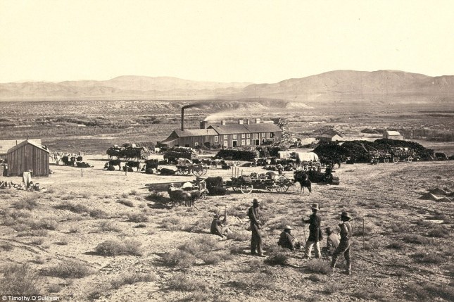
In his mining body of work unlike, Watkins his inclusion of people in his images demonstrate the contrast between the inhospitable land and the difficulties of the people who were living and working there. His work was primarily a survey and as such seen by few people but the professionals who employed him. However, Ansel Adams discovered his work many years later and it was at that point that the landscapes found new viewers.

Timothy Sullivan american wild west
19th century housing: Members of Clarence King’s Fortieth Parallel Survey team explore the land near Oreana, Nevada, in 1867. https://steampunkopera.wordpress.com/2013/08/15/real-photos-of-the-old-wild-west-timothy-osullivan/

Rather than distracting from the landscape the presence of people demonstrate and support the hostile environment giving a sense of sublime in the process.

He presented his work in an unfamiliar way unlike Watkins who was replicating an image that the viewer could imagine themselves in. By using this unfamiliar way of presenting his work he is inviting the viewer to understand more about the land, look beyond what they are seeing and it is this strange and unusual presentation that makes O’Sullivan unique.

Conclusion

During the evolution of photography we have two photographers who are both producing beautiful and sublime images. Yet, they are so very different. Watkins is producing for mass audiences and could be seen as more scientific whereas, O’Sullivan by using people in his images is more likely to make the viewer feel uncomfortable.

The images of O’Sullivan use photography conventions that we see and find in modern day landscape photography.

References

Snyder, J. (2002). territorial Photography. In: Landscape and Power, 2nd ed. Chicaco: The University of Chicago Press, pp.175-203.

Websites visited.

The J. Paul Getty Museum. Dale Creek Bridge, Union Pacific Railway http://www.getty.edu/art/collection/objects/50194/william-henry-jackson-dale-creek-bridge-union-pacific-railway-american-1885/

The J. Paul Getty Museum Desert Sand Hills near Sink of Carson, Nevadahttp://www.getty.edu/art/collection/objects/40241/timothy-h-o’sullivan-desert-sand-hills-near-sink-of-carson-nevada-american-1867/

A Steampunk Opera (The Dolls of New Albion) Real Photos of the Old Wild West: Timothy O’Sullivan https://steampunkopera.wordpress.com/2013/08/15/real-photos-of-the-old-wild-west-timothy-osullivan/ (accessed 27.11.19)

WikiMedia Commons. Yosemite Valley from Eagle Point by Carleton E Watkins https://commons.wikimedia.org/wiki/File:Yosemite_Valley_from_Eagle_Point_by_Carleton_E_Watkins.jpg (accessed 27.11.19)

Wikipedia. Oregon Portage Railroad https://en.wikipedia.org/wiki/Oregon_Portage_Railroad (accessed 27.11.19)

Wikipedia. Timothy O’Sullivan. https://en.wikipedia.org/wiki/Timothy_H._O%27Sullivan (accessed 27.11.19)

Wikipedia. Timothy O’Sullivan. A Harvest of the Death. https://en.wikipedia.org/wiki/Timothy_H._O%27Sullivan#/media/File:Timothy_H._O’Sullivan_-_A_Harvest_of_Death_-_Google_Art_Project,_grayscale.jpg

Design a site like this with WordPress.com
Get started